Dashboard Data
The Dashboard is the first stop for all users logging into the system. It contains four charts showing statistics about the organization. Each chart presented on the page identifies the duration if time the chart represents, just below its title, e.g. "Previous 7 days". To see historical data for the charts, use the Historical date widget in the top right corner of the page and select a new date. If the historical date is blank, then that means "today" and all data counts backwards from today. If the historical date picker is set to "11/02/2024" (November 2, 2024) then all charts will represent data counting backwards from this date.
Some charts have an additional data export function. To see and export the data click the  button to change the chart to the data view and export button.
Reputation Activity
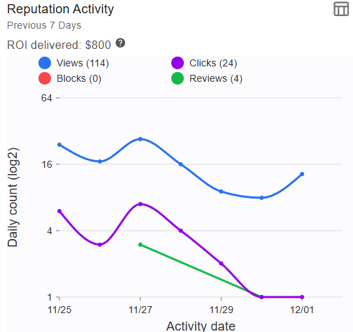
Reputation Activity highlights all review request views and clicks that patients have performed over the last seven (7) days and is a reflection of the Clicks and Views data found under Reputation. The chart calculates the value of views and clicks to help provide value to the practice's ROI.
- Impression value is counted as: views x $5
- Review value is calculated as: reviews x $200
The default values for the value of impressions and reviews are configured at the organization level and can be changed by editing the organization object under Organization > Organization. For more information on editing the organization see the Organization section of this guide. You may also hover over the question mark in the Reputation Activity chart to see the current calculations.
Higher review quantity and quality help market your organization to new potential clients. While there are many factors regarding the value of an online review, most estimates place the value of an online review between $200-$1,000.
The user actions presented on the page are:
- Views - People who have opened the public review message
- Clicks - People who have clicked through the message to potentially leave a review.
- Reviews - New reviews actually left on the monitored sites. A location must have at least one review site added to be counted.
- Blocks - People who have elected to stop receiving notifications by unsubscribing from the review messages.
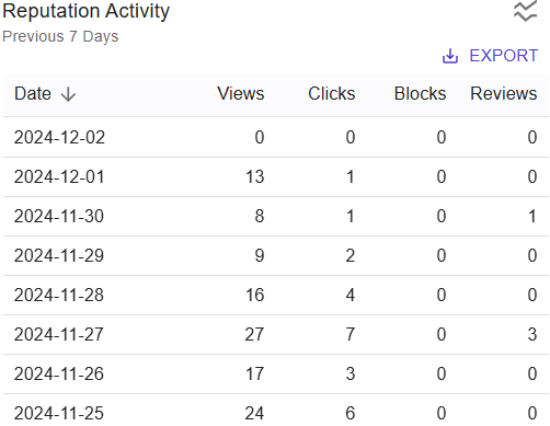
Click the data view icon to see the numerical version of the data. While in the data view, click EXPORT to export the numerical data to a CSV or XLSX spreadsheet file.
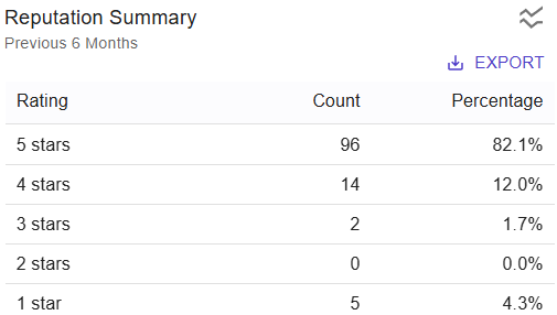
Reputation Summary
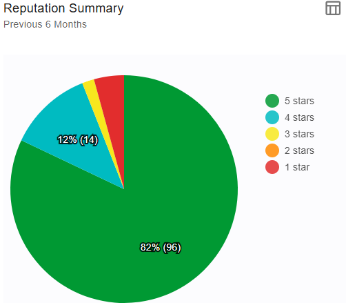
Reputation Summary shows the review ratings for all locations/practitioners within the organization over the last six (6) months. Clicking on the chart will redirect you to the Reputation Data page.
Click the data view icon to see the numerical version of the data. While in the data view, click EXPORT to export the numerical data to a CSV or XLSX spreadsheet file.
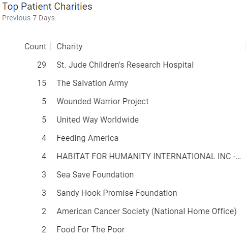
Top Patient Charities
Top Patient Charities chart shows the top ten (10) charities and the number of times they were selected as donation targets over the previous seven (7) days.
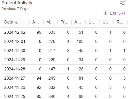
Patient Activity
Patient Activity captures patient-linked activity over the previous 30 days such as:
- Appointments - How many appointments were scheduled.
- Messages - Total number of messages sent.
- Profiles - How many times a patient manipulated their profile information.
- Amenities - How many times patients views the tenant's amenities pages.
- Undeliverables - The number of undeliverable messages that were attempted to be sent.
- Unsubscribes - The number of patient unsubscribes.
- Reviews - The number of patient reviews.
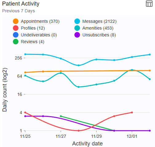
Click the data view icon to see the numerical version of the data. While in the data view, click EXPORT to export the numerical data to a CSV or XLSX spreadsheet file.
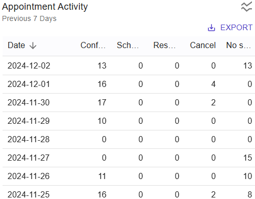
Appointment Activity
Appointment Activity captures users taking action regarding their appointments such as confirming, rescheduling, canceling, or scheduling a new appointment by using the links in the messages sent to them or via their user profile page. In the chart below you will notice periods of high and low activity. Those sorts of dips may be appropriate for your practice based on the hours the practice is open and seeing/scheduling patients. In the example below, the practice was open Monday through Friday and did not schedule nor request scheduling over the weekends. A precipitous and medium/long-term decline in patient activity could be a sign that appointment reminders are not going out at all.
Actions tracked are:
- Confirm - Patient confirms their appointment.
- Schedule - Patient has scheduled a new appointment.
- Reschedule - Patient has rescheduled an existing appointment.
- Cancel - Patient has cancelled an appointment.
- No-Show - Patient did not appear for their scheduled appointment and their appointment has been marked as a no-show in the EMR.
Click on a user action type (e.g. Confirm, Reschedule) to display or hid the user action type from the chart.
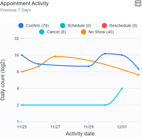
Click the data view icon to see the numerical version of the data. While in the data view, click EXPORT to export the numerical data to a CSV or XLSX spreadsheet file.
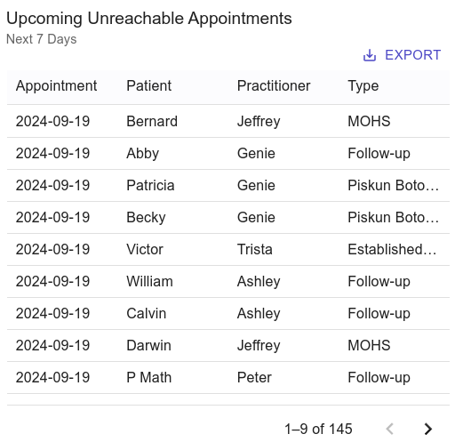
Upcoming Unreachable Appointments
Upcoming Unreachable Appointments shows patients and their appointment dates who do not have any valid contact information who have appointments coming in the next 7 calendar days. Click EXPORT to export the numerical data to a CSV or XLSX spreadsheet file.
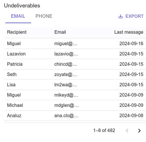
Undeliverables
Undeliverables show patients who were sent messages by email or phone that could not be delivered and the last attempted send date. The messages can be viewed in the Messaging area. Click EXPORT to export the numerical data to a CSV or XLSX spreadsheet file.
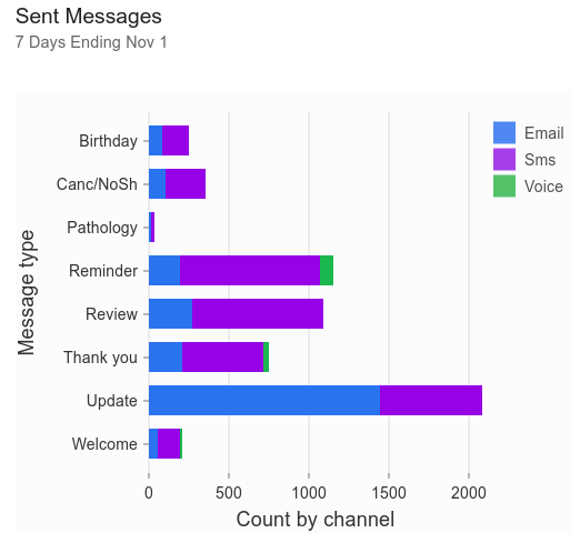
Sent Messages
Sent Messages is a stacked bar graph showing message stats for messages sent over the previous seven (7) days. Messages are grouped by type and are stacked based on the sending method (email, SMS, voice). Clicking on a colored portion of the bar will redirect you to a pre-filtered version of the Sent Messages page.
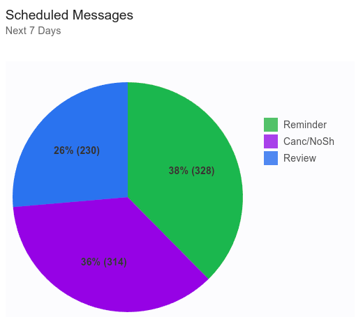
Scheduled Messages
Scheduled Messages shows messages, grouped by type, that are scheduled to be sent in the next seven (7) days. Clicking on the chart will redirect you to the Scheduled Messages page.
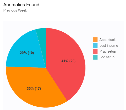
Anomalies Found
Anomalies Found highlights all accounting issues and EMR configuration issues found in the EMR within the last week. Clicking on the chart will redirect you to the weekly anomaly report.
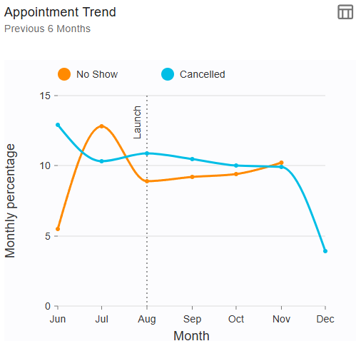
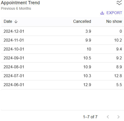
Appointment Trend
Appointment Trend shows the percentage rate for appointments where the patient did not show up (No Show) or where the appointment was cancelled. This percentage is calculated by comparing appointments with a status of No Show or Cancelled vs the total number of appointments over a period of time.
Click the data view icon to see the numerical version of the data. While in the data view, click EXPORT to export the numerical data to a CSV or XLSX spreadsheet file.
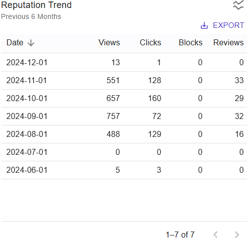
Reputation Trend
Reputation Trend shows the trends for users opening your review requests and leaving reviews over a period of time. Higher numbers for Views, Clicks and Reviews indicate a higher rate of open and positive patient activity. Higher number of Blocks indicates patients are choosing to unsubscribe from the automated messaging.
If a the chart shows an upward trend of blocks, it could be an indication your organization needs to change/update the messages being sent or that the volume of messages to your patients is too high. Both message content and message frequency can be managed by contacting support@analoginfo.com.
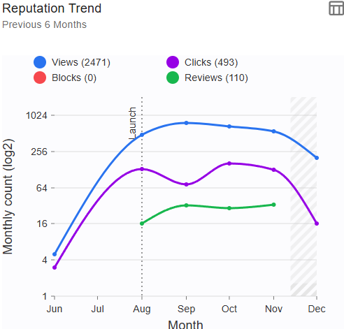
Click the data view icon to see the numerical version of the data. While in the data view, click EXPORT to export the numerical data to a CSV or XLSX spreadsheet file.
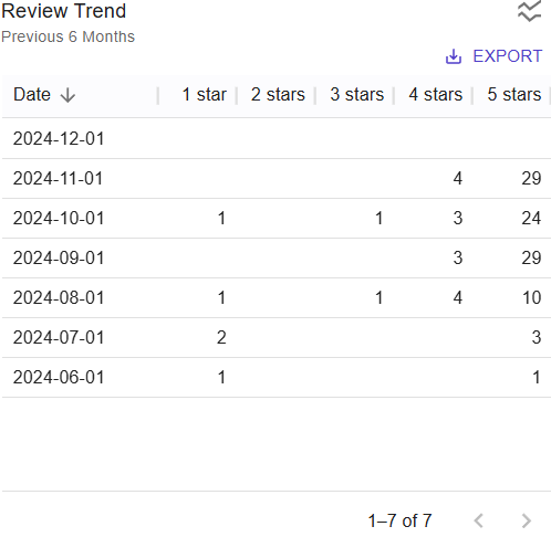
Review Trend
Review Trend shows a month by month look at the review ratings your organization is receiving over a period of time. All location/practitioners which have review sites assigned to them will be represented in this chart.
When the system is first turned on, most organizations see an upward trend in reviews. After some period of time, the review trend will start to decline and generally flatten out, assuming a consistent volume of patients. This happens because the system does not continue asking patients for new reviews if they have been asked for one within the last 90 days (configurable). Only new appointments or patients who have not been asked in the previous 90 days will receive a review request. Also contributing to the leveling off of reviews is repeat reviewers - people who have left a review previously - are not counted as new reviews by Google or Yelp, even if they update their previous review.
If your [new] patient volume increases or decreases, it should be expected to see a similar trend in the reviews.
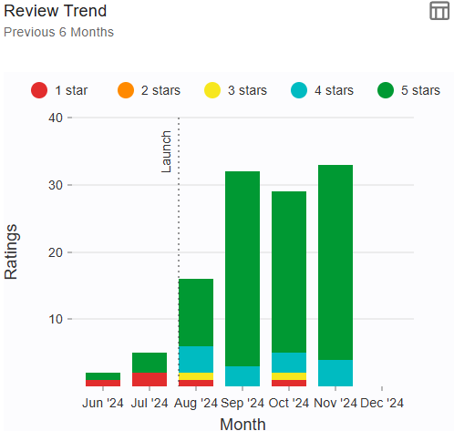
Click the data view icon to see the numerical version of the data. While in the data view, click EXPORT to export the numerical data to a CSV or XLSX spreadsheet file.
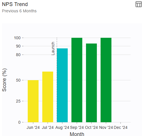
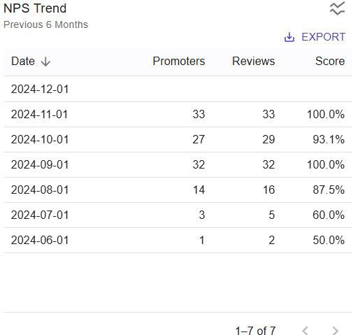
NPS Trend
Net Promoter Score (NPS) is a valuable metric in healthcare for measuring patient satisfaction and loyalty. NPS scores affect the price paid by investors for a medical practice and are a sign of the quality of the customer experience delivered and loyalty to the brand. A consistent score of 90 and above makes a practice desirable to investors.
We derive this metric by crawling Google and Yelp for practice and hospital reviews.
NPS is calculated based on a single question: "On a scale from 0 to 100, how likely are you to recommend our healthcare services to a friend or family member?" Respondents are categorized into three groups:
- Promoters (scores 90-100): Highly satisfied patients who are likely to recommend the healthcare provider.
- Passives (scores 70-80): Satisfied but not enthusiastic patients who may switch to other providers.
- Detractors (scores 0-60): Dissatisfied patients who may harm the provider's reputation through negative reviews.
NPS helps healthcare providers:
- Identify Areas for Improvement: By understanding patient feedback, providers can pinpoint issues and make necessary improvements.
- Enhance Patient Experience: Positive patient experiences lead to higher NPS scores, which can result in better patient retention and referrals.
- Benchmark Performance: Providers can compare their NPS scores with industry benchmarks to gauge their performance.
The average NPS in hospital healthcare varies, but it is generally reported to be around 38. A score above 30 is considered strong, and, unfortunately, above 50 is considered excellent (these bad metrics are due to no use of automated patient engagement in
hospitals). For private practices such as plastic surgery, many recent reviews with a 5-star rating and an NPS score above 90 are required for the highest practice value
Click the data view icon to see the numerical version of the data. While in the data view, click EXPORT to export the numerical data to a CSV or XLSX spreadsheet file.
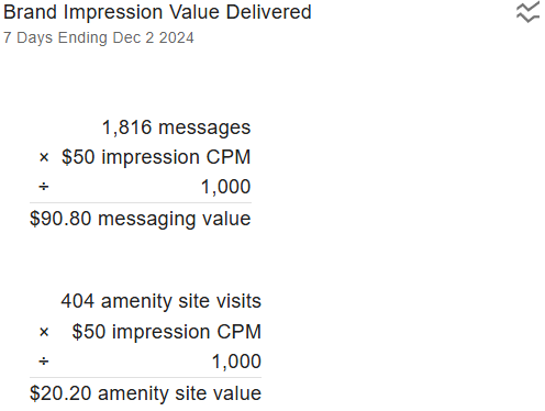
Brand Impression Value Delivered
Brand Impression Value Delivered shows the marketing value received for messages sent and patients using the amenities site.
Generally, each message sent to a patient creates an "impression" on the recipient. Impressions have a calculated marketing value of $50/1000 messages sent. In marketing terms, the more they hear from you or see you, the more likely they are to go to you [again].
Similarly, visits to your organization's Amenities site, where information about each location and what they have to offer visiting patients, also provides a marketing value of $50/1000 visits.
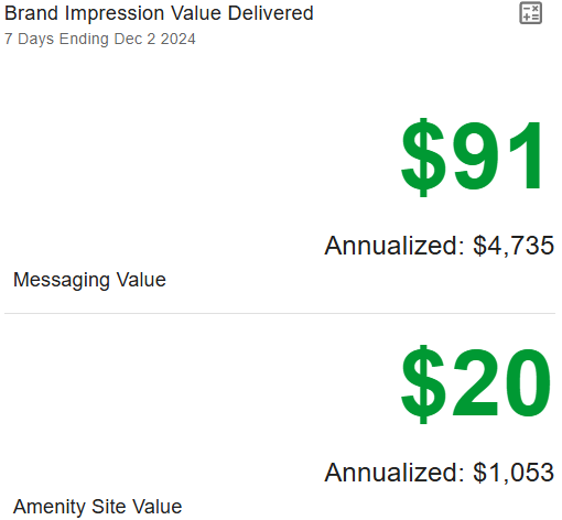
Use the Calculations button  to view the data and math that make up these values.
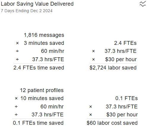
Labor Saving Delivered
Labor Saving Delivered shows the amount of labor saved by the automation provided by this service.
Consider the following: Drafting and sending a message takes time. Taking phone calls to answer repetitive information about your location or where to park takes time. Given a semi-sizable patient volume relative to front-desk staff means much more time is spent on the phone answering basic questions than dealing with patients or their data in the office.
This chart examines the amount of time that full time employee (FTE) would have spent sending messages, configuring patient profiles, and how many FTEs time have been replaced by this automation.
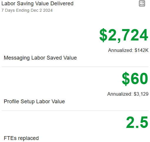
Use the Calculations button to view the data and math that make up these values.
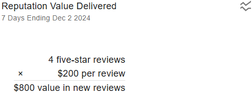
Reputation Value Delivered
Reputation Value Delivered shows the value of the 5-star reviews received over a period of time. The monetary value of a review left for a medical facility ranges from just under $200 to over $1,000, depending on the type of facility.
Analog Informatics Corporation has chosen the more conservative value for it's calculations. To change this default value, edit the value in your organization's settings.
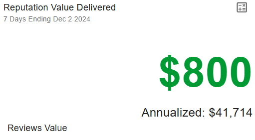
Use the Calculations button to view the data and math that make up these values.
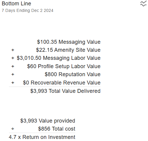
Bottom Line
Bottom Line shows the return on investment (ROI) for all metrics over a period of time. All metrics include:
- Messaging
- Messaging Labor
- Amenity Site
- Patient Profile Management
- Reputation
- Recoverable Revenue
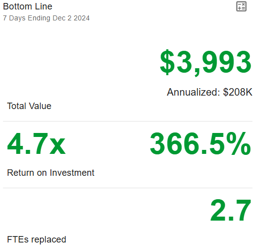
Use the Calculations button to view the data and math that make up these values.
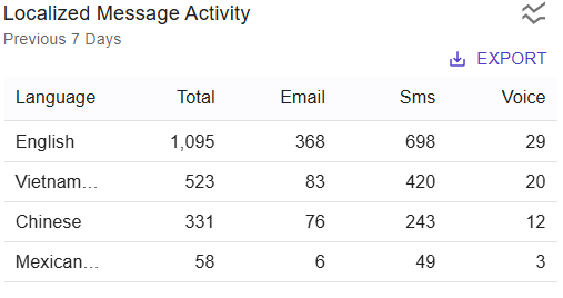
Localized Message Activity
Localized Message Activity shows the languages used by all messages and their respective formats (email, SMS/TXT, voice) over a period of time. Use this to see what languages your patients are communicating in.
The language in which a a message is written is based on the patient's demographics or the selected preferred language from the user's profile. A user's profile takes precedence over EMR configurations.
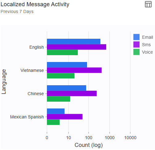
Click the data view icon to see the numerical version of the data. While in the data view, click EXPORT to export the numerical data to a CSV or XLSX spreadsheet file.
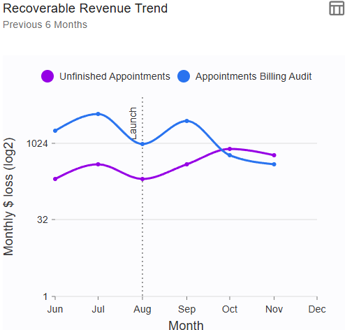
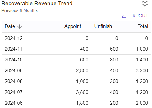
Recoverable Revenue Trend
Recoverable Revenue Trend data is based on the billing and appointment anomaly data.
A downward trend or a low flat trend is ideal as your organization properly closes appointments and encounters and corrects any previously detected anomalies.
An upward trend indicates that appointments are not being properly closed. This leads to lost revenue as improperly closed appointments (e.g. appointments not closed or missing encounters) cannot be billed and may also affect the communication workflow with a patient.
Click the data view icon to see the numerical version of the data. While in the data view, click EXPORT to export the numerical data to a CSV or XLSX spreadsheet file.
The numerical data shows a dollar amount (Total Appointments x $200). The value of an appointment is defined in your organization's settings
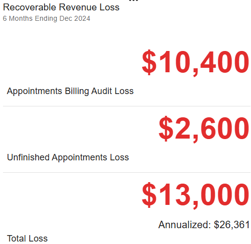
Recoverable Revenue Loss
Recoverable Revenue Loss shows all revenue that could have been billed over a period of time if billing and appointment anomalies were rectified. Lower numbers are better and indicate more appointments are being properly closed.